Friday, April 26, 2013

MoMA’s Jackson Pollock Conservation Project: Insight into the Artist’s Process
Pollock at work in his studio, 1950. Photo: Hans Namuth
Jackson Pollock at work in his studio, 1950. Photo: Hans Namuth
In the May 1951 issue of ARTnews a selection of photographs by Hans Namuth appeared as illustrations for Robert Goodnough’s article, “Pollock Paints a Picture.” The images depict a focused  Pollock energetically applying paint to a large canvas spread across his studio floor. Namuth’s photographs presented the first visual record of the artist’s unorthodox painting technique to a broader audience, and the images of the working method behind Pollock’s radically new pictures captivated the public’s imagination. Their power has been such that, for the past 60 years, these photographs have largely defined our understanding of Pollock’s process.
Thus far, our Pollock blogging has focused primarily on how conservators assess the condition of and treat  a work of art. In addition to caring for the Museum’s collections, though, MoMA conservators frequently pursue technical art historical inquiry to clarify curatorial questions and better understand artists’ material choices and working methods. The Pollock project has been one such opportunity to fill some of the gaps in the popular narrative established by Namuth’s now-iconic photographs.
Questions regarding Pollock’s choices and technique may be investigated through primary source documentation such as photographs, artist’s statements, and first-hand accounts. We gather these resources, and illuminating information can be gleaned from them. However, they are ultimately limited, with accounts of art-making captured in an isolated instant, edited by ego, or filtered through memory.
In the conservation studio, we have access to an additional, crucial resource: the work of art itself, in this case Pollock’s paintings. In one of our earlier posts, we looked closely at One: Number 31, 1950 and noted several surface effects that Pollock was able to achieve. Now, let’s explore some of these observations more thoroughly.
As we’ve covered One’s surface inch by inch, first in looking, then in cleaning, we’ve become intimately acquainted with the paints and other materials to be found there. In the 1950 murals, Pollock moved decisively away from the densely worked surface of late 1940s paintings like Full Fathom Five (1947).
Jackson Pollock. Full Fathom Five. 1947. Oil on canvas with nails, tacks, buttons, key, coins, cigarettes, matches, etc. Gift of Peggy Guggenheim. © 2013 Pollock-Krasner Foundation / Artists Rights Society (ARS), New York
Jackson Pollock. Full Fathom Five. 1947. Oil on canvas with nails, tacks, buttons, key, coins, cigarettes, matches, etc. Gift of Peggy Guggenheim. © 2013 Pollock-Krasner Foundation/Artists Rights Society (ARS), New York
In 1947 we see Pollock’s technique achieves a surface of poured and splattered paint that veils underlayers of brushwork. Many of these paints, even some of the gestural tendrils, are artist’s oils rather than industrial housepaints.

Pours of black and aluminum paint crisscross an underlayer of thick, white brushwork. An embedded paint cap can be seen just up and to the left of center]
Pours of black and aluminum paint crisscross an underlayer of thick, white brushwork. An embedded paint cap can be seen just up and to the left of center

Jackson Pollock. One: Number 31, 1950. Oil and enamel paint on canvas. Sidney and Harriet Janis Collection Fund (by exchange). © 2013 Pollock-Krasner Foundation / Artists Rights Society (ARS), New York
Jackson Pollock. One: Number 31, 1950. 1950. Oil and enamel paint on canvas. Sidney and Harriet Janis Collection Fund (by exchange). © 2013 Pollock-Krasner Foundation/Artists Rights Society (ARS), New York
In contrast, although One has the most complex, tightly composed layer structure of the 1950 murals, Pollock manages to embrace a lightness and vastness across the huge canvas. The physical flinging, pouring movements seen in Namuth’s photographs lend themselves to One’s scale, and much of the canvas is left bare, providing moments of calm throughout the energetic composition.
The few, scattered spots of bright yellow artist’s oil paint stand out against One’s subdued palette of enamel paints
Pollock thinned his paints to achieve a range of consistency. Here, dilute paints seep into the canvas, staining it with pigment
Pollock thinned his paints to achieve a range of consistency. Here, diluted paints seep into the canvas, staining it with pigment
With the exception of the rare hint of a bright naples yellow oil paint, Pollock composes One wholly using industrial paints. These paints flow much more readily than artist’s oils, and Pollock often further thinned them, producing a delicate stain of color.
Unlike the cigarette, key, handful of tacks, and other found materials embedded in the surface of Full Fathom Five, the inclusions we found in One appear to be a mark of Pollock’s process and chance rather than deliberately placed elements. The bits of wood that dot the uppermost white layer could be remnants of a stick that Pollock was using in lieu of a paintbrush, or, like the fly that came to rest in this passage of black, they may just be the detritus that comes with working on the floor of a barn.
Scattered small bits of wood can be seen, primarily in a white paint that appears to be one of the final layers that Pollock applied
A housefly met his end in a pour of black paint
Beyond thinning his paints to desired consistency, Pollock appears to have been interested in the medium itself as a “paint,” applying it either wholly on its own or thinning a color so extensively that it essentially becomes tinted medium. Across the bottom of the painting, for example, we see periodic regions of pure medium. Pigmented paints swirl unevenly in the yellowed, darkened resin. Pollock evidently applied the medium independently rather than adding it to a single color.
The translucent gold-amber substance is cured, concentrated medium
Similarly, we encounter areas of hazy mixing that have a distinctly different look than typical wet-into-wet paint layering. To achieve such diffuse bleeding of color Pollock may have been pouring turpentine directly onto wet, layered paint rather than mixing it in the can as he usually did.
Typical wet-into-wet paint mixing. Notice how the edges of the colors flow into each other
Compare the blending (above, to the left, etc) to the hazy swirl of multiple colors achieved by generous amounts of paint thinner
Compare the blending (above, to the left, etc.) to the hazy swirl of multiple colors achieved by generous amounts of paint thinner
Such attention paid to small sections of the composition is omitted or at the very least overlooked in the narrative of Pollock’s technique as established by Namuth’s photographs. But the evidence doesn’t end there. We see mark-making on One that powerfully suggests that Pollock’s sense of this vast composition was based on a nuaunced reading of minute details.  Along the bottom center of the painting the viewer will notice a cascade of controlled, rust-brown drips. Compare the deliberate nature of these marks to the five haphazard spots of pale pink located nearby.
A series of uniform, brown drips deliberately follows a black passage of paint
A few scattered pink drips, in contrast, appear more likely to be the result of random studio accidents
The Namuth photographs show One tacked to the wall of the studio as Pollock continues to work on other paintings. While the pink paint can be attributed to studio accident as Pollock painted another work close by, the brown drips are not so easily explained. These brown drips are closely associated with a substantial underlying pour of black paint whereas the few pink drips appear randomly across the very bottom of the painting. It is also clear that the brown drips occurred very late in the development of the composition; none is covered or touched by another layer of paint. Finally the brown drips are all similar in length, all ending in a slight swell of paint: the final mark of gravity pulling paint down a vertical surface. It thus appears very likely that Pollock, the artist who so famously painted horizontally, also finished the composition in a more traditional manner, making a few final edits as the painting hung vertically on the studio wall.
And this deliberate control of his paint appears to have increased as Pollock moved into the black-and -white paintings of 1951. Pollock pared down his palette and, in composing Echo: Number 25, 1951, his mark-making as well.
Jackson Pollock. Echo: Number 25, 1951. Enamel paint on canvas. Acquired through the Lillie P. Bliss Bequest and the Mr. and Mrs. David Rockefeller Fund. © 2013 Pollock-Krasner Foundation / Artists Rights Society (ARS), New York
Jackson Pollock. Echo: Number 25, 1951. 1951. Enamel paint on canvas. Acquired through the Lillie P. Bliss Bequest and the Mr. and Mrs. David Rockefeller Fund. © 2013 Pollock-Krasner Foundation/Artists Rights Society (ARS), New York
When looking at the back of Echo, thin, interior lines can be seen that correspond to the broader paint marks

 Viewed from the front, the lines of paint exhibit a pulsating quality: the result of Pollock’s tools and technique
Viewed from the front, the lines of paint exhibit a pulsating quality, the result of Pollock’s tools and technique
The reverse of Echo reveals evidence that the black pour paintings were not necessarily poured at all. While it’s known that Pollock, during this time, began applying his paint with turkey basters, one still envisions the artist’s energetic dance around the canvas. The distinct lines that we observe from the reverse, though, argue that Pollock was in direct contact with the canvas as he worked, essentially drawing with the baster. On the reverse of the canvas we see thin lines inside the broader marks of black paint. These thin spines of paint represent the points at which baster touched the surface as the artist squeezed the baster’s bulb to release a pulse of enamel paint onto the canvas. When viewed from the front, the pulsing application of paint is evident in the rhythmic round bulges of the lines. Therefore Pollock’s technique in Echo, in a sense, merges drawing and painting in the moment of his engagement with the canvas.
Finally, much has been discussed about the extent and nature of Pollock’s return to recognizable imagery in his work, and dissecting Echo’s composition reveals elements of familiar images from the artist’s early sketchbooks. Another telling parallel can be drawn between Echo and Pablo Picasso’s Girl Before a Mirror (1932). The close parallels reveal that Pollock’s fascination and competition with Picasso continued even at the later stages of his career. Notice the compositional similarities between the two works. Compare the head, eye, outstretched arm, and belly of Picasso’s Girl to the analogous forms in Echo. Might the crosshatching we see in Pollock’s painting represent a shorthand for the diamond-patterned background of Girl?
From left: Jackson Pollock. <em>Echo: Number 25, 1951.</em> 1951. Enamel paint on canvas. Acquired through the Lillie P. Bliss Bequest and the Mr. and Mrs. David Rockefeller Fund. © 2013 Pollock-Krasner Foundation/Artists Rights Society (ARS), New York; Pablo Picasso. <em>Girl Before a Mirror.</em> 1932. Oil on canvas.  Gift of Mrs. Simon Guggenheim. © 2013 Estate of Pablo Picasso/Artists Rights Society (ARS), New York
From left: Jackson Pollock. Echo: Number 25, 1951. 1951. Enamel paint on canvas. Acquired through the Lillie P. Bliss Bequest and the Mr. and Mrs. David Rockefeller Fund. © 2013 Pollock-Krasner Foundation/Artists Rights Society (ARS), New York; Pablo Picasso. Girl Before a Mirror. 1932. Oil on canvas. Gift of Mrs. Simon Guggenheim. © 2013 Estate of Pablo Picasso/Artists Rights Society (ARS), New York
Such observations, arising from the seemingly simple act of close looking offer us a richer understanding of Pollock’s paintings and can have implications for the established understanding of his process, priorities, and intent.

Thursday, April 25, 2013

A big day for "post modernism"

Appeal Finds Fair Use In Richard Prince’s “Canal Zone” Series

Image from Patrick Cariou's book "Yes Rasta" (2000) p 118 | Richard Prince's "Graduation" (2008) (Image courtesy of Hyperallergic's tumblr)
Postmodernism is having the best day ever. It’s been just over a year since a New York District court dealt a major blow to Richard Prince, finding his Canal Zone series guilty of violating the copyright in Panamanian landscape photographs and Rastafarian portraits by Patrick Cariou. Not only was Prince found guilty, but the court ordered all unsold Canal Zone artworks and catalogs sent to Cariou so that they could be destroyed, sold, or disposed of as he saw fit. Thankfully, today sees a win for art: the case’s defendants won an appeal with the United States Court of Appeals for the Second Circuit.
Gagosian and Prince appealed that decision on the grounds that Prince makes fair use of Cariou’s photographs, often altering them very slightly with painting and collage. The Supreme Court only defines fair use as needing to “alter the original with ‘new expression, meaning, or message.’” The lower courts interpreted this to mean that, in order to make fair use of Cariou’s photographs, Prince must “comment on Cariou, on Cariou’s Photos, or on aspects of popular culture closely associated with Cariou or the Photos.” (Satire, for example, would be fair, as in the ruling’s mention of 2 Live Crew’s parody of Roy Orbison’s “Oh, Pretty Woman”). The higher courts disputed that definition: “We agree with Appellants that the law does not require that a secondary use comment on the original artist or work, or popular culture…” In other words, the appellate court has allowed Prince to use the images for personal expression.
This was, and still is, a big deal: if the first ruling were applied across the board, anyone who’s ever copied, altered, collaged, or generally riffed on virtually anything could be in huge legal trouble. For the lower court, Prince didn’t transform Cariou’s originals enough; the alterations (like pasting Baldessari-esque dots to faces or collaging nude bathers in a manner akin to Picasso’s Demoiselles d’Avignon) were minimal. The ruling is full of considerations as to what this would mean if artists were no longer allowed to reinterpret other people’s images. Just for an idea of what that would look like, the court mentions that even Andy Warhol potentially wouldn’t have been safe from the ruling:
Much of Andy Warhol’s work, including work incorporating appropriated images of Campbell’s soup cans or of Marilyn Monroe, comments on consumer culture and explores the relationship between celebrity culture and advertising.
Still, the appeal leaves it to the lower court to decide just how much an artist needs to affect an image in order to change it. There are still five photographs the court has refused to judge (Graduation, Meditation, Canal Zone (2007), Canal Zone (2008), and Charlie Company)–because their alterations are so small. They write of those images:
While the lozenges [in Graduation], repetition of the images, and addition of the nude female unarguably change the tenor of the piece, it is unclear whether these alterations amount to a sufficient transformation of the original work of art such that the new work is transformative.
And, when it comes down to it, that’s a question of whether, and for whom, these are effective works of art.

Thursday, April 18, 2013

Hi there!

Airport Scanners Reveal Hidden Masterpiece

Date: 10 April 2013 Time: 05:22 PM ET

Tuesday, April 16, 2013

ARTISTS TO BE FAMILIAR WITH...UPDATED!

GIOTTO
CIMABUE
LIMBOURG BROTHERS
JAN VAN EYCK
ROGIER VAN DER WEYDEN
BOSCH
GHIBERTI
BRUNELLESCHI
MASSACIO
DONATELLO
VERROCHIO
BOTTICELLI
FRA ANGELICO
MANTEGNA
PIERO DELLA FRANCESCA
LEONARDO
MICHAELANGELO
RAPHAEL
BELLINI
GEORGIONI
TITIAN
PARMIGIANO
TINTORETTO
GRUNEWALD
DURER
HOLBEIN
BRUEGEL
EL GRECO
VELAZQUEZ
BERNINI
CARRAVAGIO
RUBENS
REMBRANDT
VERMEER
HUGO VAN DER GOES


Wednesday, April 10, 2013

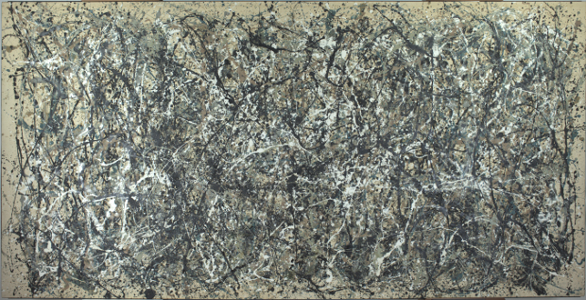
Saltz on the Death of the Gallery Show

October 9, 1982 - New York, New York, United States: Keith Haring solo exhibition opens at Tony Shafrazi Gallery in SoHo. Tony Shafrazi is pictured bottom center. Haring (May 4, 1958 ? February 16, 1990) was an artist and social activist whose work responded to the New York City street culture of the 1980s. By expressing concepts of birth, death, sex and war, Haring's imagery has become a widely recognized visual language of the 20th century. The MusÈe d?Art Moderne de la Ville de Paris, in association with Le CENTQUATRE, is devoting a wide-ranging retrospective to Haring in order bear witness to the importance of his work, in particular its profoundly "political" content. Almost 250 pictures on canvas and tarpaulins and from subway walls, as well as twenty monumental works, will be exhibited at Le CENTQUATRE, making this one of the largest presentations of Haring?s works ever. (Allan Tannenbaum/Polaris) /// Keith Haring at Tony Shafrazi Gallery, 1982.
Gallery shows: light of my life, fire of my eyes. I love and long for them. I see maybe 30 a week, every week of the year. Much of what I know about contemporary art I learned from hanging around artists and from going to galleries. Bad shows teach me as much as good ones. A great thing about galleries—especially for someone who spends most of his time alone at a computer, typing—is that they’re social spaces, collective séances, campfires where anyone can gather. I’m a blabbermouth, so in galleries I turn to strangers and blurt whatever I’m thinking about whatever we’re looking at. If they don’t think I’m a creepy geezer, they’ll tell me what they’re thinking, too. Then I see whole new things. As disembodied as they can be, galleries are places where one can commune with the group mind. We have more of them than any other city does, and admission is free.
The clustering of hundreds of galleries in several neighborhoods has meant that a huge swath of the art world is continually being presented at our doorstep. That is changing, and changing fast. These days, the art world is large and spread out, happening everywhere at once. A shrinking fraction of galleries’ business is done when collectors come to a show. Selling happens year-round, at art fairs, auctions, biennials, and big exhibitions, as well as online via JPEG files and even via collector apps. Gallery shows are now just another cog in the global wheel. Many dealers admit that some of their collectors never set foot in their actual physical spaces.
The beloved linchpin of my viewing life is playing a diminished role in the life of art. And I fear that my knowledge of art—and along with it the self-knowledge that comes from looking at art—is shrinking.
Artists and dealers are as passionate as ever about creating good shows, but fewer and fewer people are actually seeing them. Chelsea galleries used to hum with activity; now they’re often eerily empty. Sometimes I’m nearly alone. Even on some weekends, galleries are quiet, and that’s never been true in my 30 years here. (There are exceptions, such as Gagosian’s current blockbuster Basquiat survey.) Fewer ideas are being exchanged, fewer aesthetic arguments initiated. I can’t turn to the woman next to me and ask what she thinks, because there’s nobody there.
Instead, the blood sport of taste is playing out in circles of hedge-fund billionaires and professional curators, many of whom claim to be anti-market. There used to be shared story lines of contemporary art: the way artists developed, exchanged ideas, caromed off each other’s work, engaged with their critics. Now no one knows the narrative; the thread has been lost. Shows go up but don’t seem to have consequences, other than sales or no sales. Nothing builds off much else. Art can’t get traction. A jadedness appears in people who aren’t jaded. Artists enjoying global-market success avoid showing in New York for fear any critical response will interfere with sales. (As if iffy international art stars could have their juggernauts stalled by a measly bad review or two. A critic can only dream.) Ask any artist: They’re all starting to wonder what’s going on.
I don’t even mind so much that the role of the critic is diminishing. Clement Greenberg was a bully, anyway. Primacy always belongs to art and the artist. I’ve tried to keep overhyped careers in check, and had no effect whatsoever. In fact, so many shows in so many places mean that we now have an overload of writing about art. Joseph Beuys said, “Everyone is an artist.” Now everyone actually is a writer. Like exhibitions that can’t get traction, commentary also has a hard time gaining a foothold, unless you yourself enter the arena of spectacle, becoming something of a spectacle yourself. (Believe me; I know.) Adding to this, a generation of academically trained critics were taught to believe they should write in impenetrable language and refrain from opinion and negative criticism.
This is not to say that art is not selling. Websites for high-end sales and auctions are burgeoning. We read of sites with technology that allows collectors “to visualize artwork in 3-D space without ever leaving your desk,” an “animated gif display,” an “online sales platform,” “sortable JPEG images.” We hear of an “online collector profile and gallery … to list your preferences and to view our art selections tailored to you.”
When so much art is sold online or at art fairs, it’s great for the lucky artists who make money, but it leaves out everyone else who isn’t already a brand. This art exists only as commerce, not as conversation or discourse. Art dealer Kenny Schachter has noted that “the higher and higher prices are for fewer and fewer artists.”
Those sales platforms are proliferating, too. Paddle8 advertises that it provides two types of online auctions. Another, called Artspace, recently raised $8.5 million in expansion capital, including money from the Russian collector Maria Baibakova, who also owns a “platform for cultural production.” Still another site, Artsy—co-­founded by Dasha Zhukova, partner of billionaire Russian collector Roman Abramovich—says it will “make all the world’s art accessible to anyone with an Internet connection.” The CEO tells us, “The more you use Artsy the more we learn about what you like. Over time, we can better suggest things for sale that you might like. Even if there are no works by an artist for sale today … in the future, if the work becomes available, we’ll notify you.”
The auction houses are in on the new game as well. Christie’s, in partnership with a company called Y&S, now provides “a venue for emerging artists not yet represented by galleries” and “creates a bridge between young artists and a young audience.” Translation: “We’re cutting out dealers. Come on down. Make a killing.” Thus, unrepresented artists go straight to auction. Work that is sold this way exists only in collector circles. No other artist gets to see it, engage with it, think about it. The public functions of the gallery space and its proprietors—curation, juxtaposition, ­development—are bypassed and eliminated. All these people supposedly want to help artists, and they probably think they are doing so. But they’re engaged in something else, and it makes being around art less special. Too many of the buyers keep their purchases in storage, in crates, awaiting resale. Mediocre Chinese photorealism has become a tradeable packaged good.
I’ll admit that there’s something democratizing about all this. All those buyers can judge for themselves what they like and put their bank vaults where their taste is. The paradox is that art is not inherently democratic. It’s a kind of meritocracy—albeit with the interior high-school rules of some other nebula. Today, those with the most money are the only ones whose votes count. Although I love that young broke artists who can’t travel to New York or Berlin can look at art online, think about what it means, and use this information in their own work, seeing art in the flesh really gives you something unique. I have only once gone underground to see cave paintings. But that one cave made an enormous difference in my life.
So far, thank goodness, the galleries themselves are not disappearing, but that day may be coming. Owing in part to the Chelsea condo-and-office boom, even the successful ones are fighting for their financial lives. The excellent Postmasters Gallery just saw its West 19th Street rent raised to $30,000 a month and will have to move. Other mid-level Chelsea dealers are being priced out as well. Longtime gallerist Casey Kaplan told Bloomberg News, “You won’t find much experimentation if the rents continue to escalate …those kinds of galleries won’t be here.” Postmasters’ owner, Magda Sawon, has explained that “mid-range galleries are going to just vanish from Chelsea,” adding, “the whole middle is basically pulverized.” Even if they survive, I wonder whether a much bigger shakeout is about to happen, one that makes art resemble any mainstream business—just another culture industry that’s eaten itself alive.
Or whether it’s about to go supernova. The galleries that are best suited to this new world are the massive multinationals, whether for reasons of territoriality, market share, or dick waving. I love big galleries as much as I do small ones, but I often wonder if these jumbo spaces aren’t often aesthetic elephant graveyards—places where ambitious artists and the movements of the sixties and seventies go to die. Many feel impersonal, and the art can look lost in them. David Zwirner’s new building on 20th Street adds 30,000 square feet to his space. (I still can’t figure out why part of his new floor is shiny travertine.) The multinational Hauser & Wirth just added what looks like a blimp hangar on West 18th Street. Last I heard, Larry Gagosian, the biggest elephant of all, has eleven spaces around the world. Perhaps the others are all supersizing themselves just to compete with Larry. Or maybe they want to inherit artists from older established galleries like Gladstone and Marian Goodman. But shouldn’t these dealers be looking for young talent rather than vying to show Lawrence Weiner and Shirin Neshat? Maybe everyone will all eventually share Richter and Prince, who will just relocate every five years.
Bigness isn’t inherently bad. The dealer Gavin Brown has said that giant art is suited to our age: “When we are able to fly around the globe in 24 hours, and that is a common occurrence … these large-scale works might be an unconscious attempt to rediscover awe.” I agree. But bigness raises prices, and big galleries encourage it. That’s not about awe; it’s about money. The shows themselves should be smaller, too—I see many exhibitions that would be twice as good at half the size. Even Rubens would’ve had a hard time filling these supersize spaces, let alone doing it once every two years. Duchamp said, “I could have made a hundred thousand readymades in ten years easily. They would have all been fake … [A]bundant production can only result in mediocrity.” Many artists are now in “abundant production,” seducing collectors on the prowl for stuff to fill their oversize atriums. I’m not sure that a lot of what they’re making is art at all, and if the artists aren’t making art and the collectors aren’t collectors, the galleries selling this product to these people aren’t really galleries anymore, either.
Art doesn’t have to be shown in New York to be validated. That requirement is long gone. Fine. But consider this: At a Chelsea opening, a good Los Angeles dealer chided me for not going to art fairs, not seeing art in L.A. and London, and not keeping track of the activity online. He said I “risked being out of touch with the art world,” and he was right. It got me down. As recently as four or five years ago, I could have crowed that because I see so many gallery shows every week, I know what’s going on. That’s slipping away, if it isn’t already gone.
I brooded for months over this. Then I started thinking it through, and instead of focusing on the “being out of touch” part of what he said, I started thinking about “the art world.” Something clicked and brightened my mood. There is no “the” art world anymore. There have always been many art worlds, overlapping, ebbing around and through one another. Some are seen, others only gleaned, many ignored. “The” art world has become more of a virtual reality than an actual one, useful perhaps for conceptualizing in the abstract but otherwise illusory.
Once we adjust to that, we can work within the new reality. If the galleries are emptier, the limos gone, the art advisers taking meetings elsewhere, and the glitz offshore, the audience will have shrunk to something like it was well before the gigantic expansion of the art world. When I go to galleries, I now mainly see artists and a handful of committed diligent critics, collectors, curators, and the like. In this quiet environment, it may be possible for us to take back the conversation. Or at least have conversations. While the ultrarich will do their deals from 40,000 feet, we who are down at ground level will be engaging with the actual art—maybe not in Chelsea, where the rents are getting too high, but somewhere. That’s fine with me.
Looking, making, thinking, experiencing are our starting point. Art opens worlds, lets us see invisible things, creates new models for thinking, engages in cryptic rituals in public, invents cosmologies, explores consciousness, makes mental maps and taxonomies others can see, and isn’t only something to look at but is something that does things and sometimes makes the mysterious magic of the world palpable. Proust wrote, “Narrating events is like introducing people to opera via the libretto only.” Instead, he said, one should “endeavor to distinguish between the differing music of each successive day.” That’s what we do when we look at art, wherever we look at it, however much noise surrounds it. In galleries we try to discern “differing music,” and it’s still there right now. I love and long for it.  
Five Shows That Changed the Way I See Art
1. Keith Haring at Tony Shafrazi Gallery, 1982. The moment when I understood that all kinds of art could go mainstream. The opening had a “We’ve arrived” vibe.
2. Vito Acconci at Sonnabend Gallery, 1976.
When I saw Acconci’s table-gangplank-sculpture thing extend out of the gallery window over West Broadway, I decided to move to New York.
3. Kara Walker at the Drawing Center, 1994.
Vengeance was nigh in Kara Walker’s giant wall silhouette of slaves and slavers eating and having sex with one another. It was like the end of Heart of Darkness made flesh: “The horror.”
4. Matthew Barney at Althea Viafora Gallery, 1990.
Seeing one video sculpture by Barney in a large, crappy group show, I thought, Oh my God! This is one of art’s futures. My art-critic wife looked a bit, shrugged, and said, “Boys … It’s pretty male.”
5. Pipilotti Rist at Luhring Augustine, 2000.
Rist’s trippy video installation cast such a spell on me that I saw the show nineteen times. I wrote about it but forgot to say I was in love with it. I also met future art dealer and force-of-nature Michele Maccarone there.
Note: Readers should keep in mind that I arrived in New York in 1980, visiting sporadically before that, and missed many of the formative shows of the seventies. (I was eking out a living as a long-distance truck driver, then working as a chauffeur for a rich person well into the nineties.)    
*This article originally appeared in the April 8, 2013 issue of New York Magazine.
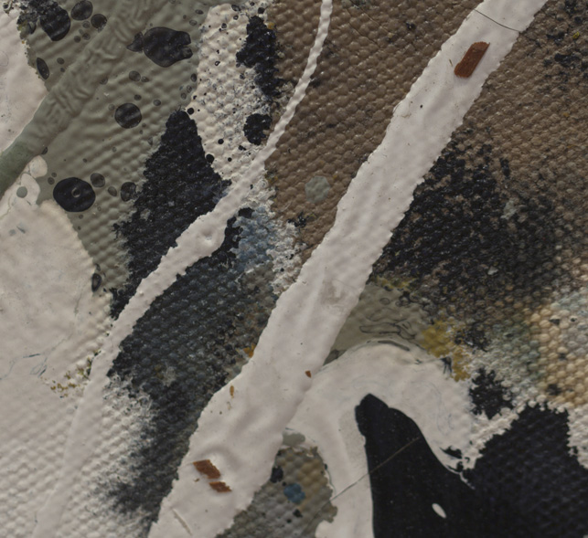
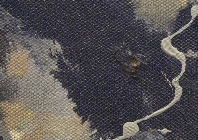
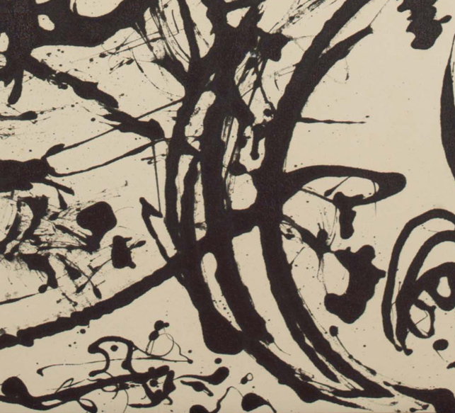
Thursday, April 4, 2013

Caravaggio


    The Calling of St. Mathew - Christ detail, 1599-02

    Caravaggio